
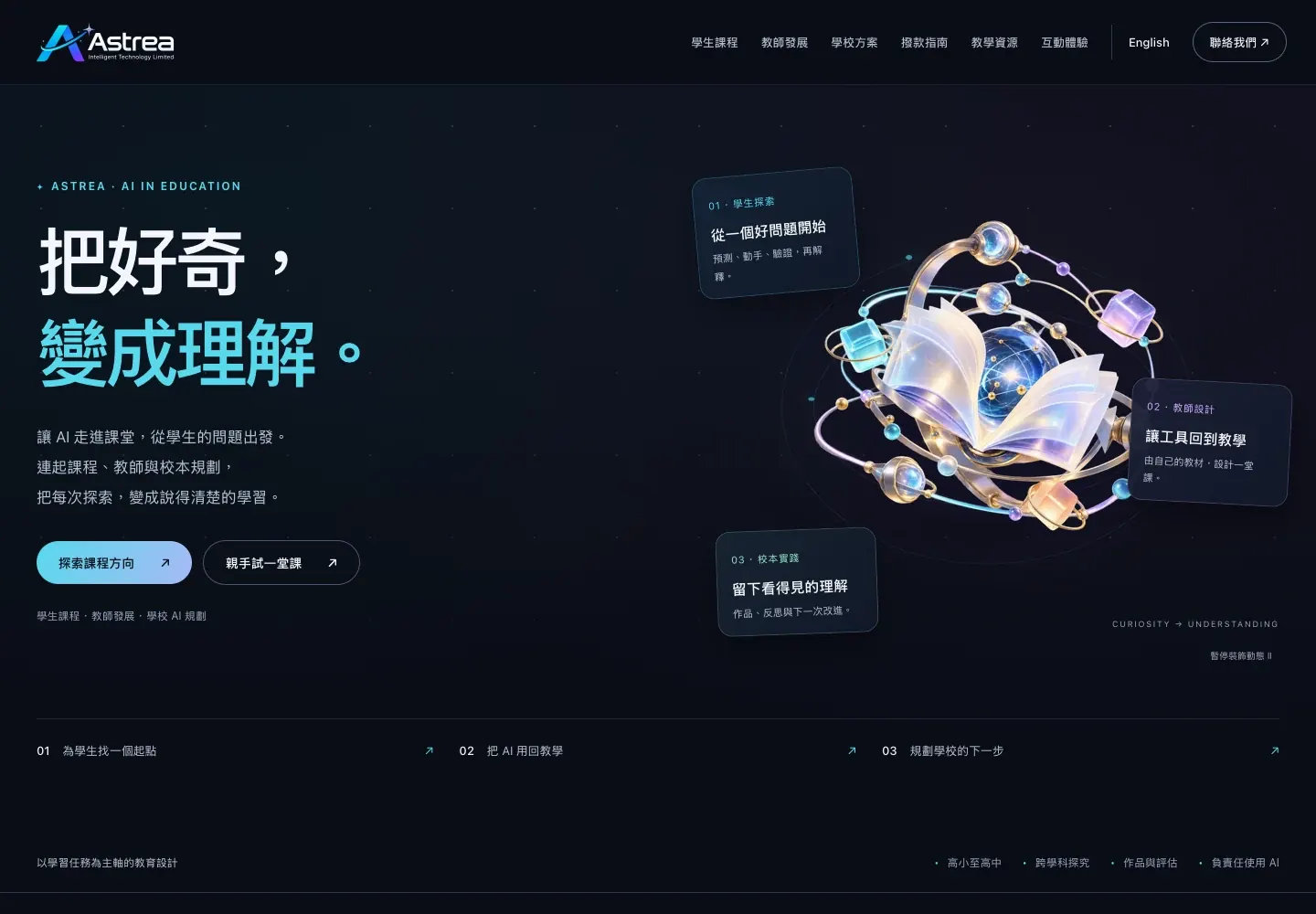
Education website / 2026
Astrea AI Education Platform
Connecting AI learning with courses and resources.
 BRAND × AI
CASE STUDIES / WORK
Brand, events, websites and AI applications. Explore the context, approach and work behind each project.
Try another keyword or reset the categories.
SELECTED RECENT WORK
Education website / 2026
Connecting AI learning with courses and resources.
BRAND & EVENT WORK
85 works · 5 categories
From brand identities and event visuals to images and publications. A project may include several pieces of work.

F&B Branding
A cohesive visual approach connects baked products, the shop environment, promotional touchpoints and social content without losing the warmth of the bakery experience.
The bakery brand needed product displays, in-store communication, promotional messages and social posts to feel related. Treating each touchpoint independently would make the customer experience fragmented and weaken recognition of the products and shop.
The visual direction centres on product texture and an inviting retail atmosphere, coordinating layout, colour and image use so promotional information stays legible without overpowering the baked goods themselves.

Institutional Space
Spatial wayfinding, a service wall and recruitment materials connect the centre's positioning, visitor information and talent outreach within one coherent visual system.
The youth innovation centre needed to explain its institutional role, available services and recruitment needs within the same physical environment. Fragmented information would make visitor orientation, reception and talent communication feel like unrelated activities.
The centre's role is translated into information layers that can be read along the visitor journey, while service walls and recruitment materials share consistent headings, graphic cues and content categories.

Exhibition Update
Updated exhibition graphics, presentation templates and brand materials make the centre's ideas, services and activities easier to understand in person and in meetings.
The centre had accumulated information about its purpose, services and activities, but disconnected exhibition and presentation materials left visitors with isolated fragments rather than a clear understanding of its positioning and priorities.
The content is reorganised through clear chapters and a consistent brand language, balancing exhibition viewing distance with presentation pacing so guided visits and external briefings can follow the same narrative.

Brand Identity
A logo, identity rules and application direction establish a visual foundation for presentations, promotional materials and cultural tourism event settings.
The cultural tourism concept had to hold a sense of place, human stories and the travel experience together. A standalone logo without usage rules would make later materials visually inconsistent.
Natural and cultural references inform the symbol, typography and colour direction, establishing an identity foundation that can extend into presentations, campaign materials and event environments.

Park Branding
Park identity, investment communication and spatial displays align the life-science positioning across business presentations and the physical visitor environment.
The life science park needed to explain its industry positioning, location and resources to companies, visitors and partners. Disconnected investment and spatial materials could not form a complete professional impression.
The park identity anchors investment layouts, information graphics and environmental visuals, giving technical content a clear hierarchy that can extend consistently across different business touchpoints.

Tourism Branding
A proposal framework brings together cultural tourism positioning, brand character and visual direction to discuss the project's core story and possible development.
The tourism concept included local stories, experience design and possible commercial extensions. While the direction remained under consideration, stakeholders needed a proposal deck that made positioning and visual choices comparable.
Cultural context, audience imagination and brand character are organised into chapters with visual references and application examples, clearly presenting a proposed direction rather than claiming completed production or implementation.

VI Manual
Logo, colour and core usage rules provide a consistent foundation for investment materials, exhibition displays, office applications and later design work.
The park identity would appear across investment, exhibition, office and event settings. Without proportion, colour and lock-up rules, each new material could introduce a conflicting version of the brand.
The manual centres on logo construction, clear space, standard colours and basic combinations, giving later designers directly usable specifications and a shared starting point for the park identity.

Brand Application
Business cards, staff badges, gifts and office materials extend the park identity into everyday contact points with a consistent professional presentation.
After the core identity was established, reception, staff and business exchanges still relied on many physical items. Without application rules, the logo and information hierarchy would vary across different formats.
Identity elements are configured around the function of cards, badges, gifts and office items, accounting for size, information hierarchy and production constraints to form a repeatable application system.

Exhibition Wall
Wall-based content presents park positioning, industry resources and investment information so visitors understand the project's value progressively along the tour route.
Exhibition visitors receive information while moving. If the park story, industry conditions and investment content used presentation-level density, the material would fail at distance and during segmented viewing.
Topics follow the visitor route, using large headings, priority information zones and imagery so each wall can be understood independently while contributing to one coherent park narrative.

Information Design
Industry relationships, location and supporting resources become a clear map for faster understanding in investment presentations and exhibition displays.
The resource story combined geography, upstream and downstream relationships, and supporting conditions. A text list could not show how these elements connected the park with target companies and the wider industry environment.
Maps and relationship diagrams layer location, industry nodes and amenities with controlled legends and labels, making the visual suitable for a large display as well as inclusion in an investment deck.

Biotech Exhibition
Brand introduction, mapping, wall panels and directional materials form an exhibition system that communicates biotechnology content with clarity.
The biotechnology story included brand background, technical fields and spatial information. Visitors moving through the exhibition needed to progress from overview to detail rather than encounter dense text all at once.
Introductions, maps and panels are layered along the route, using consistent headings and wayfinding elements to connect zones while keeping specialist content readable and coherent in the physical space.

Biotech Branding
Brand positioning, visual direction and content applications create a practical annual foundation for more consistent biotechnology communication.
The biotechnology brand needed to communicate across different partnership and content settings throughout the year. Making tone and visual decisions separately each time would leave no recognisable common foundation.
Brand priorities, visual direction and recurring content settings are organised into reusable components for annual operations, giving different communication materials a consistent identity and tone.

Logo System
A concise symbol, Chinese brand name and English identifier form a scalable biotechnology logo system for clear use across different media.
The brand name, scientific character and bilingual identity needed to remain readable at both small and large scales. One complex graphic would not support recognition, resizing and later applications reliably.
A simplified symbol and stable wordmark define horizontal, vertical and small-format combinations, helping the identity remain clear across documents, exhibition settings and digital screens.

Brand Applications
Logo and colour extend across flags, drinkware and display items, bringing the identity into events, reception and everyday presentation settings.
Once established, the identity still had to work on different materials and shapes. Flags, cups and display items have distinct dimensions and production methods, so one layout could not be applied unchanged.
Logo placement, colour and clear space adapt to each object's proportions while preserving shared identity features, allowing varied applications to appear as one coherent set in event and reception contexts.

Tourism Identity
Natural, cultural and travel references inform a proposed symbol direction that gives the tourism concept an extendable visual starting point.
The brand needed to condense local nature, human stories and travel experience into a symbol. At direction stage, abstraction, recognition and future application still required comparison.
Representative references generate symbol sketches and lock-up directions, testing the relationship between name and graphic as a basis for later selection and refinement rather than a claimed final mark.

Visual System
Natural qualities of the cultural tourism concept become a colour and supporting graphic system for materials, wayfinding and spatial directions.
A logo alone would not preserve the brand character when later materials introduced unrelated colours and graphics. Tourism communication especially needed a language connected to environment and culture.
Primary and supporting colours and graphic textures are drawn from natural and cultural references, with combination principles demonstrated across media as a reusable basis for later design.

Brand Collateral
Identity applications across cards, bags and cultural merchandise connect reception, visits and souvenirs through a continuous tourism brand experience.
The tourism identity appeared at physical touchpoints including reception, events and souvenirs. Different materials and functions needed shared recognition without losing the purpose of each object.
Graphics and information adapt to cards, bags and merchandise proportions while colour and symbols remain consistent, allowing the suite to support a connected visitor journey.

Tourism Wayfinding
The identity extends into destination signs that help visitors understand routes, places and branded moments throughout an outdoor tourism setting.
The outdoor destination included junctions, places and service points. Wayfinding had to work at distance and amid environmental distraction, rather than simply placing a brand poster on a sign.
Direction, destination and distance form the primary hierarchy, with brand colour and symbols added to create a wayfinding direction that can extend across different visitor-route nodes.

Commercial Identity
A distinct visual direction explores possible commercial extensions of the tourism concept across future events, retail, cultural products and partnerships.
The tourism brand needed a recognisable relationship with possible retail, event and partnership concepts. This project explores commercial identity directions for comparison and planning.
Symbols, colours and scene applications extend the parent brand into visual proposals for retail, cultural products and partnerships. Operational delivery would be a separate project.

Office Identity
Staff cards and office materials extend the park identity across reception, employee identification and everyday administrative touchpoints.
Staff and visitors encountered cards, documents and office items daily. If those applications sat outside the brand system, the park identity would remain limited to investment displays.
Logo, personal information and colour are arranged for office use, balancing recognition and production so everyday administrative materials continue the established visual identity.

Brand Packaging
The park identity extends to a gift bag that connects investment reception, event giveaways and a visible mobile brand touchpoint.
The bag remained in use after reception or events, so its design needed distance recognition while respecting printable areas, handles and physical production constraints.
A clear logo, brand colour and restrained graphics structure the front and back, turning the gift item into a simple but recognisable identity application.

Brand Merchandise
The park identity extends to a practical umbrella application for everyday use, investment reception and visible brand recognition.
An umbrella is divided into panels, and opening, closing and distance viewing change the graphic effect. A flat layout could place the logo across ribs or seams.
Logo and brand colour follow the panel structure, controlling repetition and visible positions to balance practical production with clear recognition in use.

Environmental Graphic
Branded glass graphics add hierarchy and clear identity cues across office, reception and display spaces while preserving practical use.
Glass partitions had to balance transparency, privacy and spatial recognition. Dense graphics would block sightlines, while minimal information would fail to identify the brand or zones.
Logo, patterns and open areas follow glass dimensions and eye level, balancing environmental identity with the functional needs of the office and visitor setting.

Opening Campaign
An opening key visual connects invitations, long-form social graphics and promotional posters so the new shop launches with one recognisable message across channels.
A new-shop launch had to coordinate invitations, storefront visibility, promotional details and social anticipation at the same time. Inconsistent information hierarchy would dilute the opening theme and leave customers unclear about the intended next step.
A flexible opening visual was developed for invitations, long graphics and posters, with density adjusted for each reading context while preserving the same brand tone, key message and recognisable visual elements.

Event Visual
A proposed key visual, floor plan and supporting materials align the exhibition identity across recruitment, exhibitor communication and on-site visitor guidance.
The brand expo brought together organiser information, exhibitor communication, venue planning and visitor guidance. Without a shared visual thread, these different materials would increase coordination effort and make the physical event harder to understand.
The proposal develops an extendable visual language from the exhibition theme, bringing floor planning, recruitment content and on-site prompts into one system so different event stages can remain visually connected.

Community Campaign
A key visual, table cards and on-site extensions support resident education, event navigation and participation through one accessible campaign language.
The community health event needed residents to understand its topic, participation method and on-site process quickly. Information scattered across unrelated materials would weaken both visitor guidance and the educational purpose of the campaign.
A friendly, legible key visual aligns table cards and venue prompts, arranging messages in the order residents encounter them so educational content and practical action guidance reinforce each other.

Public Event
An exhibition board combines the programme theme, activity steps and selected photographs for on-site viewing, project reporting and later communication.
The event had to explain its theme, action process and photographic record within limited exhibition space. Simply stacking text and images would prevent on-site viewers from identifying the programme's main points quickly.
The board establishes a reading sequence through a thematic introduction, action milestones and selected photographs, remaining recognisable from a distance while also serving as a compact project recap for later use.

Event Media
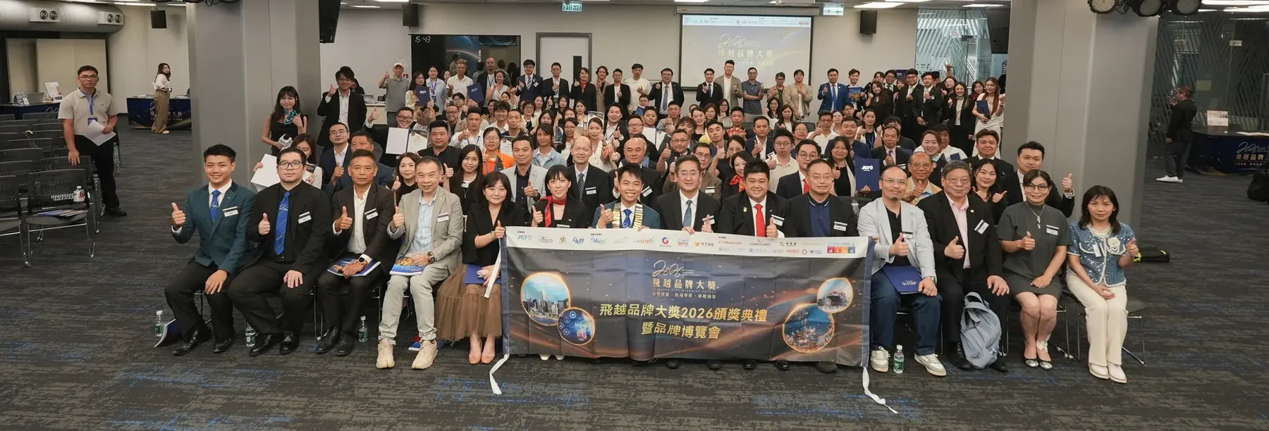
Opening ceremony, guest interview and atmosphere photography create an event record suitable for news releases, social updates and a later brand recap.
The awards opening included formal ceremony moments, guest interaction, interviews and audience response. A collection limited to fixed stage photographs would not convey the event's pace, participation or broader setting.
Coverage follows the opening sequence, key people, exchange moments and environmental details, producing a balanced image set that can serve both formal documentation and later communications without inflating the event's outcomes.

Campaign KV
A key visual combines the programme theme, partner identities and city imagery for recruitment, music and social communication across a multi-part event.
The programme connected recruitment, music and city exchange within one event. Its visual had to accommodate partner marks and varied programme information without allowing the central theme to disappear.
The direction uses departure and city connection as its core image, with clear title hierarchy and extension rules so each programme segment can retain specific information while sharing one identity.

Expo Visual
The exhibition key visual and recruitment design language keep partner outreach, on-site displays and later promotion connected through one recognisable identity.
The expo moved from early exhibitor recruitment into venue presentation and later promotion. Rebuilding its look at every stage would prevent brand recognition and partner communication from accumulating coherently.
The visual direction draws on the exhibition positioning and city connection, reserving room for recruitment decks and varied layouts so each stage can use a shared identity without losing its own information needs.

Public Health
Health education, action reminders and event information are organised into a clear exhibition board for resident learning and on-site orientation.
Vaccination communication combined explanatory knowledge, practical reminders and event arrangements. With limited viewing time, the board needed to help residents of different ages identify the essential information quickly.
Strong headings, information zones and readable graphics establish the viewing order, preserving the seriousness of health information while providing practical prompts for participation at the venue.

Campaign Signage
Consistent colour, campaign messaging and directional cues extend into outdoor flags that improve event visibility and help residents find the activity.
The community event had dispersed entrances and walking routes, so residents needed to recognise its location and direction from a distance. A conventional poster layout would not translate directly to tall outdoor flags.
The key visual is reduced to recognisable colour fields, short messages and directional elements, with proportions adjusted for outdoor viewing so the flags create atmosphere while serving a practical wayfinding role.

Event Collateral
Tabletop and entrance prompts translate event information into practical tools for visitor flow, interaction reminders and explanation of service steps.
After arrival, participants encountered different information at the entrance, service desks and activity zones. Large exhibition boards alone could not carry every detailed process instruction or timely reminder.
Content is organised for entrance recognition, tabletop reading and close-range prompts, using consistent graphics to connect service points and reduce reliance on repeated verbal explanations from event staff.

Event Wayfinding
The key visual extends across entrances, signs, stage and supporting materials to give a large multi-part event consistent identity and clear visitor movement.
When recruitment and music activities shared a venue, participants encountered entrances, zones, stages and service points. The event needed a wayfinding language that could be recognised quickly across these different locations.
Entrance identification, direction prompts and zone markers follow the venue route, adapting the key visual to varied formats while balancing functional information with the atmosphere of the programme.

Recruitment Visual
A vertical display concentrates programme background, participation details and recruitment information for quick reading and enquiries at the event venue.
The entrance and recruitment area needed to explain the programme, intended participants and joining method within a narrow format. Too much information would make distant headlines compete with close-range details.
The layout follows a vertical reading order from theme to benefits and action, controlling density so the roll-up attracts attention from afar while supporting a more detailed in-person explanation.

Event Deck
A presentation system combines the event identity, programme flow and partner information for recruitment, music programming and stakeholder communication.
The recruitment fair and concert crossed employment, performance and partner coordination. A shared deck was needed to place the event purpose, programme and stakeholder information within one structure for discussion.
The event identity defines chapter and page templates, separating background, programme flow and partnership content so different audiences can locate the sections most relevant to them quickly.

Booth Design
The expo identity extends across booths, display stacks, tabletops and supporting materials to create a coherent spatial experience for exhibitors and visitors.
Booths combined organiser information, exhibitor brands and product displays. Their varied dimensions and structures could easily create visual fragmentation and weaken recognition of the overall exhibition environment.
A shared grid, identity placement and information zones guide each booth while allowing brand differences, connecting display stacks, tabletops and back walls into an orderly system.

Venue Planning
A venue plan coordinates booth placement, visitor flow and material distribution for discussion and implementation within a shopping-centre branch venue.
The branch venue was constrained by entrances, customer flow, existing facilities and booth dimensions. Booths, displays and activity areas needed to be reviewed together on one plan before implementation.
The proposal arranges booths and visitor routes around venue conditions, marking key visual and material positions so organisers, venue representatives and production teams can align on the intended setup.

Expo Wayfinding
Entrance, zone, direction and programme signage form a practical visitor journey while extending the exhibition's overall visual identity through the venue.
The venue included entrances, exhibition zones, a stage and service locations. Visitors had to make quick decisions while moving, so decorative graphics could not substitute for clear directional information.
Entrance markers, zone names and direction prompts follow the visitor route, using consistent colour and symbols with type size and information density adjusted for each viewing distance.

Stage Screen
Ceremony theme, partner identities and stage composition form an opening screen that supports atmosphere and a consistent photographic background.
The awards opening needed to present event identity and partner organisations on a large screen that would also remain behind guests and stage photography for an extended period.
Theme text and partner marks are arranged for the stage proportions, with brightness, clear space and distance legibility controlled so the screen supports the ceremony without competing with people on stage.

Event Props
Event messages and partner identities extend into handheld signs and photo props for interaction, group photographs and social sharing at the ceremony.
Guests needed simple, recognisable interaction materials during photographs and networking. Long messages or poorly balanced partner marks would become difficult to read once the items appeared in event imagery.
Event phrases are reduced to concise messages, with type and shapes sized for handheld use and identity positions controlled so different combinations remain clear in group photographs.

Opening Production
Entrance treatment, displays, directions and venue materials are coordinated as a production proposal for building a temporary opening-event environment quickly.
The temporary opening had limited preparation time. Entrance, display, direction and decoration items needed one coordinated dimension and content list to reduce omissions during venue setup.
Materials are separated by venue touchpoint, with artwork and production specifications organised into a coherent proposal that can guide fabrication and installation coordination for the event.

Conference Visual
A venue proposal connects the conference key visual, stage environment and material plan across ceremony, forum and guest reception settings.
The leadership transition conference combined ceremony, forum and reception functions. Stage, entrance and supporting materials needed alignment at proposal stage so stakeholders could compare atmosphere and information placement.
The key visual extends into stage, wayfinding and reception items through scene mock-ups and configuration plans, clearly presenting proposed directions without claiming that production or installation was completed.

Venue Activation
A branch-venue proposal uses key visuals, event information and scene mock-ups to explain the intended relationship between mall booths and interaction zones.
The Nansha branch needed to fit brand booths, programme information and interaction areas into a shopping centre. Spatial mock-ups and visual proposals support layout decisions; installation remains subject to venue and production confirmation.
Key visuals, booths and interaction points are configured around the mall environment, using scene representations and information hierarchy for discussion while reserving venue and production details for later confirmation.

Retail Display
Multiple exhibitor requirements are organised into one display-stack system that stays clear, comparable and appropriate to the exhibition environment.
Shared exhibition displays brought together packaging, information and brand colours with very different visual weights. Handling each independently would remove overall order and make visitor recognition more difficult.
Common display specifications define brand, product and information zones, balancing visibility across exhibitors while allowing individual product character to remain within a consistent exhibition framework.

Booth System
Additional booth and brand requirements extend the existing visual system while preserving identification and information hierarchy within limited space.
New booths and brand details arrived during event preparation. Rebuilding the system was unnecessary, but inserting content without adaptation would compromise dimensions, readability and production output.
Existing grids and identity rules guide a revised allocation of brand and information zones, with layouts prepared for new output sizes so additions connect naturally to the established exhibition system.

Event Layout
A floor plan aligns booths, entrances, stage and visitor routes so organisers, venue staff and production teams can discuss one shared configuration.
The venue had to contain booths, a stage, entrances and service zones. A text list alone would leave different teams with conflicting interpretations of positions, passages and material relationships.
Functional zones, primary routes and display points are marked on the venue plan, enabling a shared review of visitor flow and configuration before it is used for execution coordination.

Event Screen
Event theme, partner identities and festive atmosphere form a screen visual for venue projection, the opening sequence and consistent brand presence.
The exchange event screen needed to identify the theme and partners while fitting a festive setting. Excessive decoration would reduce the distance legibility of text and organisational marks.
Theme, partner identities and festive elements are arranged for the screen proportions, preserving visual space for people and stage activity so the image works at opening and as a continuing background.

Opening Production
Dimensions, artwork and production specifications turn an existing doorway into a clear, professional first impression for a temporary opening event.
The temporary entrance had to fit an existing doorframe and visitor sightlines. A flat design alone could not resolve seams, proportions and installation positions across the physical structure.
Brand artwork and entrance information are mapped to each face of the doorframe, with panel divisions and production considerations marked so the temporary treatment retains a complete identity.

Guest Identity
A guest badge extends the opening identity while supporting reception, entry and on-site grouping within a suitably formal event presentation.
The opening event needed to receive different guests and identify them quickly. Badges had to hold name or category information while retaining recognisable event identity at normal wearing distance.
Clear name zones, role hierarchy and key visual elements structure the badge, balancing practical recognition, lanyard use and continuity with the wider set of event materials.

Community Health
A lightweight display board organises community health messages for on-site guidance, public education and interaction with residents.
The community event needed movable health information for close-range reading. Fixed walls or large boards would not fit every interaction point, and content had to match short visitor attention spans.
Core knowledge and action prompts are condensed into visual sections, with type and spacing adjusted to the KT-board format for flexible placement around the event.

Event Wayfinding
Additional outdoor flags and entrance guidance extend the established event theme across recruitment, music and reception routes.
After venue confirmation, extra outdoor and entrance positions required new wayfinding pieces. Those additions needed to join the existing event identity rather than introduce a competing direction.
Existing colours and graphics are simplified for tall flag proportions and combined with entrance prompts, allowing the supplementary pieces to connect naturally with the original venue system.

Event Collateral
Supplementary vertical displays place policy, event and guidance information clearly at additional recruitment and exchange locations.
New information points at the venue required extra roll-ups carrying policy, programme and direction content. Copying the original materials would ignore the viewing distance and purpose of each new position.
The event identity is retained while headings and priorities are rearranged for each location, allowing each roll-up to serve an introduction or guidance role within one coherent system.

Stage Visual
A blue technology-led stage direction supports formal presentation across meeting, ceremony and guest-entry settings.
The conference needed to compare different stage atmospheres. The blue direction had to feel professional and contemporary while accommodating event title, partner marks and people on stage.
Layered blue fields and technology-inspired lines form the background, with title and identity positions controlled as a proposed main-stage direction for stakeholder comparison.

Event Signage
The blue stage concept extends into boards, flags and entrance guidance for consistent identity across conference touchpoints.
Without extension into entrances and routes, the stage direction would feel disconnected from the participant journey, and practical guidance would not relate clearly to the conference identity.
Blue colours and graphics adapt to board, flag and entrance formats, forming a proposed wayfinding set designed to accompany the blue stage direction.

Stage Visual
A red stage direction offers a more celebratory and ceremonial atmosphere for comparison before the conference environment is confirmed.
The conference needed to compare blue and red directions before confirming the stage. The red proposal had to feel celebratory while retaining formality and clear on-stage information.
Layered red fields and ceremonial graphics form a stage-design proposal, with space for people, titles and identities, for comparison with the blue direction before confirmation.

Check-in Zone
The red theme extends into a check-in and photo area for a connected arrival, portrait and social-sharing environment.
The check-in zone was the first place participants stopped and photographed. It needed to continue the red stage direction while leaving room for event naming and groups of people.
Red thematic elements, title and clear space are arranged around check-in and photography viewpoints, creating an entrance-scene proposal paired with the red stage option.

Venue Planning
A floor plan aligns entrances, stage, reception and venue zones for discussion between the event team and venue representatives.
The ceremony and forum involved different movement needs for guests, participants and staff. Verbal explanation alone could create conflicting assumptions about entrances, reception and stage positions.
Functional zones, primary routes and reception points are marked on the venue plan for discussion with the event and venue teams. Final arrangements depend on confirmed on-site conditions.

Healthcare Content
A repeatable social poster system presents screening plans, service information and health education through clear, consistent visual communication.
Healthcare communication had to carry screening information, educational content and calls to action at once. Inconsistent hierarchy or tone would make it difficult for readers to distinguish public information from service promotion.
The poster series uses readable headlines, dedicated information zones and stable brand elements, allowing each post to stand alone while maintaining consistency across an ongoing social publishing programme.

Product Shoot
Drink close-ups and venue imagery build a richer product atmosphere for platform listings, social content and updates to the bar's retail presentation.
The bar needed to show both the detail of its drinks and the setting in which customers experience them. Product-only or interior-only photography would each provide an incomplete view of the brand.
The shoot brings drink texture, tabletop detail and the venue environment into one visual language, creating a practical image set for platform profiles, social publishing and refreshed in-store brand presentation.

Brochure Photography
Ground-level photography, aerial views and brochure-ready imagery communicate the project's scale, setting and spatial qualities for property and investment presentations.
The development needed to communicate architectural scale, environmental relationships and detailed spatial experience at the same time. A single viewpoint would not support a complete brochure narrative or different project audiences.
Ground views, detail compositions and aerial perspectives form a layered image library, allowing the brochure to move from the wider location into specific settings, features and the experience of using the space.

Photo Live
Speaker, audience and networking moments become timely image content for same-day publishing while preserving a useful record for partner and event follow-up.
The salon's value came from speaker ideas, audience response and person-to-person exchange. Live photo coverage needed to supply usable material during the event without sacrificing the fuller record required afterwards.
Coverage prioritises stage highlights, audience participation and exchange moments, curating images for immediate publishing while retaining a broader set suited to programme recaps and updates for participating partners.

Expo Visit
Brand displays, visitor interaction and exhibition details are captured so a short expo visit becomes reusable material for recaps, social posts and presentations.
An expo visit moves quickly while booths, product demonstrations and business exchanges happen in parallel. Without structured coverage, the event would leave only disconnected snapshots once the visit ended.
The image set combines exhibition context, representative displays and human interaction, creating a rounded view that can be reused in visit recaps, social publishing and presentation materials.

Video Recap
A recap cover and edited short-form video organise exhibition highlights for post-event social publishing, partner updates and a reusable brand record.
After the expo, footage covered the opening, booths, exchanges and visitor interaction. Without an editorial thread, the recap would become a montage of disconnected scenes rather than a useful account of the event.
Representative moments are selected around the event's rhythm and paired with a concise narrative and cover, helping viewers understand the exhibition while retaining segments partners can reference in their own updates.

Video Content
Interviews, lesson footage and consistent social covers make the school's teaching philosophy, educator stories and course experience easier to understand.
The value of music education lies in teaching philosophy, educator experience and the learning process. Course names alone could not communicate the school's character or help families understand its approach.
Interview highlights are combined with lesson and performance footage in a short-form structure, while a consistent cover system distinguishes topics clearly across social channels.

Event Highlights
Annual meeting highlights, team interaction and venue footage are shaped into a memorable recap for internal review and communication of company culture.
The annual meeting included speeches, performances, recognition and team interaction, producing footage with different pacing and purposes. It needed editorial structure to convey both atmosphere and cultural priorities accurately.
The edit follows the programme through its opening, significant moments and natural interactions, creating a coherent highlight story while retaining useful segments for team and social communication.

Sales Brochure
A compact brochure organises the park positioning, spatial advantages and investment information for meetings, exhibition distribution and project introductions.
Investment conversations often allow limited reading time, while audiences need to grasp the park's positioning, location and spatial conditions quickly. A full presentation is not always suitable for on-site distribution.
The folded format condenses key propositions, location information and contact pathways into a clear visual hierarchy, allowing the piece to work independently or alongside a representative's spoken introduction.

Sales Collateral
Floor plans, transport, amenities and investment points are consolidated into a practical leaflet for on-site sales conversations and later follow-up.
Prospective companies assess layouts, location, amenities and investment conditions together. When those details sit in separate documents, representatives struggle to explain the offer and prospects struggle to compare options afterwards.
The floor plan becomes the primary reading element, supported by dedicated zones for transport and amenities, allowing the leaflet to guide an in-person explanation and remain useful when taken away.

Flyer Design
A flyer organises event highlights, exhibition zones and visitor information for offline distribution, partner promotion and practical on-site guidance.
Potential visitors receiving a flyer at a partner location, in public or at the venue had little time to judge the event's relevance. The piece needed to answer what, where and how to participate.
Event highlights form the first information layer, followed by exhibition and visitor details, with front-and-back density controlled so the flyer attracts attention while remaining useful for orientation.

Exhibitor Materials
Standardised cards present exhibitor names, product categories and booth information so visitors can identify and understand participating brands quickly.
The expo brought together brands with different naming, product and description lengths. Without a common format, on-site identification would feel fragmented and visitors would struggle to compare exhibitors.
Fixed zones for brand identity, category and booth information preserve each exhibitor's recognition while giving the full card series consistent dimensions and a predictable reading pattern.

Review Publication
Event imagery, exhibition content and partnership memories are organised into a review publication for external sharing and continued partner communication.
After the exhibition, photographs, programme information and partnership material remained across different sources. Selection and editorial structure were needed to create a readable record rather than a simple accumulation of assets.
Materials follow event stages and thematic chapters, coordinating cover, image pacing and text hierarchy to create a version suitable for sharing, archiving and reference by participating partners.

Recruitment Collateral
A flyer brings together the visit itinerary, event highlights and participation information so prospects can understand the value and next step quickly.
The recruitment piece served people interested in exhibiting and those joining a visit, two audiences with different priorities. Mixing all details together would obscure both the itinerary and action pathway.
A shared event proposition leads into separate zones for itinerary, participation method and response route, helping each reader locate relevant information according to their purpose.

Publication Cover
Watercolour texture and an anniversary theme create a distinctive publication cover with an appropriate sense of occasion for the service organisation.
The twentieth-anniversary publication needed to communicate organisational identity, the milestone year and a celebratory mood. Visuals that felt overly commercial or excessively solemn would not suit the occasion.
A gentle watercolour language frames the anniversary number and club name, with print-ready hierarchy and clear space creating a commemorative tone that remains approachable.

Gala Publication
A high-contrast stage mood and gala theme shape a formal cover for an anniversary celebration, guest reception and commemorative publication.
The gala cover had to communicate a formal dinner, performance atmosphere and organisational identity in print. Excess information would weaken the event name and essential date placement.
Spotlight-inspired contrast creates a stage presence, while the event title, club name and supporting details follow a controlled hierarchy suited to a formal commemorative publication.

Commemorative Booklet
A formal colour palette, cover and chapter system structure historical themes, event records and cultural content in a commemorative publication.
The commemorative content combined history, activities and cultural chapters. It required a formal but uncrowded editorial structure, since weak hierarchy would make the long-form reading experience unnecessarily heavy.
A dignified colour direction establishes the cover, while chapter openings, headings and image pacing separate the material into a publication suitable for reading, preservation and event display.

Health Publication
Hepatitis education is organised into an approachable booklet for outreach activities, community communication and public reading.
The topic included medical terms, prevention information and action reminders. A public booklet needed to reduce reading barriers without allowing oversimplification to replace accurate health communication.
Short sections, priority prompts and approachable visuals create a reading path suited to event distribution and community use while keeping the health information clear.

Study Visit
Exhibition tours, exchange sessions and city presentation scenes document the study journey and create useful material for education and youth exchange communication.
The study visit moved through guided displays, discussions and city presentation settings. Its imagery needed to explain the itinerary while preserving the educational value of how participants interacted with speakers and places.
Coverage follows the itinerary through wide settings, guided interaction and meaningful details, then organises the photographs into a sequence suitable for programme review, educational exchange and outward-facing introductions.

Business Visit
Company visits, working discussions and on-site demonstrations are documented as practical visual material for a cross-border business programme and its follow-up communication.
The cross-border itinerary combined company introductions, guided visits and business discussions. Coverage needed to preserve formal exchange while also showing what participants observed and how they interacted, rather than relying only on group photographs.
The photography follows itinerary milestones through workplace settings, explanations, discussions and representative details, producing a selected image set for partnership review and subsequent business communication.

Delegation Visit
Guided visits, exchanges and location photography document an overseas business delegation for social updates, presentations and a grounded partnership recap.
The international visit needed to show what the delegation saw, whom participants met and the settings they explored. Ceremonial group photographs alone would not explain the itinerary's substance or partnership context.
The coverage maps guided tours, introductions, discussions and observations of the venue, creating photographs that function as a formal record while retaining enough narrative detail for presentations and follow-up communication.

Exchange Visit
Roundtable discussion, project introductions and guided visit imagery document the delegation journey for institutional exchange, park presentation and later communication.
The visit combined a formal roundtable, project explanation and on-site tour. These stages needed to form a coherent account of the exchange rather than leaving only ceremonial images without substantive context.
Coverage moves from meeting overviews and speaking interactions into the guided venue visit, adding representative details to create imagery that can support park introductions and later project communication.

Market Strategy
A proposal brings together product story, market positioning and channel content to support discussion of a health-food brand's mainland direction.
Before entering the mainland market, the brand needed a clearer view of audience understanding, its product story and content suited to each channel. The deliverable is a market promotion proposal.
Product characteristics, intended use contexts and channel content are organised into a proposed message and asset structure, preserving room for later market validation, refinement and stakeholder decisions.

Event Strategy
A strategy deck connects event background, value proposition, exhibitor recruitment and on-site content for cross-organisation coordination and outreach.
Early-stage partners and prospective exhibitors needed to understand why to participate, how the event was structured and what each stage required. Disconnected documents could not create a shared understanding.
The proposal organises positioning, audience value, recruitment flow and venue framework into clear chapters, separating confirmed information from items requiring later agreement so stakeholders can discuss the programme responsibly.

Award Identity
Organised award-logo files and usage specifications support consistent application across key visuals, screens, print and partner identity arrangements.
The award mark appeared repeatedly on screens, printed pieces, event backgrounds and partner layouts. Inconsistent source files could introduce proportion, colour and resolution problems across those applications.
Logo versions, lock-ups and output specifications are organised with suitable formats and clear space for common uses, allowing later event materials to reference one stable identity system.

Product Kit
Product range, brand story and presentation layouts form a coherent information kit for clearer channel and customer introductions.
The food and lifestyle range needed to explain relationships between products, the brand background and individual characteristics. Scattered information would increase effort for channel presentations and customer comparison.
A range overview provides the entry point, followed by layered product information and brand story, creating a consistent set for sales conversations and product presentation.

Pet Product Launch
A bright product visual, packaging presentation and launch content support clear introduction of the pet range and extension into social channels.
The new pet product needed to communicate category, packaging and brand character together. A visual focused only on playfulness would leave consumers unclear about the actual product offer.
A lively colour language and clear product focal point retain packaging legibility, with content areas designed to extend naturally into social launch posts.
DIGITAL EXPERIENCES
12 projects

Website & platform
A public platform organises multiple services, trilingual content, case assets and enquiry routes for continued expansion.
Services span brand, content, events and cross-border markets. A gallery alone could not explain background, delivery roles or next steps, while the site also needed Traditional Chinese, Simplified Chinese and English access.
Services, representative cases, the work library, Insights and institutional collaboration create a clear route from exploring capabilities to discussing a project in three languages.
Content strategy, design and development for Starbay Media's own brand website
The scope covers the brand website, trilingual content, case library and maintenance. Rankings, enquiries and sales also depend on market demand and ongoing operations and are not guaranteed.
Discuss a similar brief →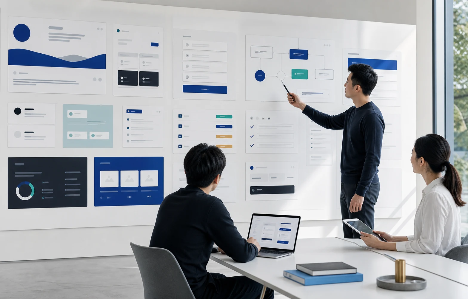
Website & platform
Website, SEO/GEO, AI assistance, growth marketing and free tools are organised into a clear technology-marketing entry point.
Multiple service lines made navigation, cases, content and calls to action compete. The AI assistant also had to stay within public knowledge and defer sensitive confirmation to a person.
Website, marketing, content and AI services are organised around customer needs. The assistant answers general questions and refers enquiries requiring individual confirmation to the team.
PromoPioneers brand website, shared portfolio of Starbay Media's technology and marketing delivery partner
The scope covers the promopioneers.cc brand website, content navigation and AI enquiry entry point. The assistant uses public website information; the team confirms quotations, delivery arrangements and individual requirements.
Discuss a similar brief →
Website & platform
A no-login, browser-local tool gives small businesses a low-friction starting point for invoices and quotations.
A complete enterprise system may be too heavy for an early team, while blank documents make recurring format and data consistency difficult to maintain.
The tool first handles common documents without accounts and keeps data in the browser; CRM, permissions, notifications and payment remain possible later extensions.
PromoPioneers' own free tool, shared portfolio of Starbay Media's technology and marketing delivery partner
The tool gives no accounting, tax or legal advice and is not a full ERP, payment or formal accounting system.
Discuss a similar brief →
Website & platform
GBA News newsroom development connects Greater Bay Area topics, source checking, articles, cover imagery and website content management.
Greater Bay Area coverage spans cities and subjects. Readers need clear context, reliable sources and a consistent reading experience, while editors need to coordinate copy, imagery and categories.
Source checking and editorial judgement guide a workflow connecting topics, writing, covers, summaries and categories, making articles easier to read, discover and maintain.
Newsroom workflow and content-system development for Starbay Media's own media platform
This case reviews newsroom development and past content operations, not a commitment to a current daily publishing service. Editors remain responsible for topic selection, factual judgement and publication arrangements.
Discuss a similar brief →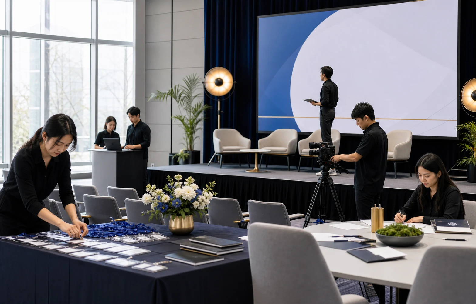
Website & platform
The awards website, applications, judging, email, programme publication and event content are organised across a traceable operating journey.
A major awards programme spans business recruitment, applications, judging, guest invitations and the ceremony. Each stage needs consistent information, clear responsibilities and timely delivery.
The awards website connects participant information with the programme journey. Application documents, judging communications, the programme publication and event visuals are coordinated across delivery stages.
Website, content and event operations support for the Elite Brand Awards institutional programme; EBA is not a Starbay-owned brand
The scope covers website, communications and event operations support. Participant data is handled with privacy safeguards, judging decisions remain with the judging process, and awards, media exposure or commercial results are not guaranteed.
Discuss a similar brief →
Website & platform
Dental content moves from one-off production into a regular workflow spanning website articles, imagery and social channels.
Dental information needs readable explanations, reliable sources and responsible medical wording. Website and social content need shared themes adapted to how people read on each platform.
Common reader questions guide a shared content brief for website articles, imagery and social copy, keeping information, tone and calls to action consistent.
Website and social content operations for a dental brand
The scope covers dental brand content and patient education, not disclosure of patient data or individual diagnosis. Content does not replace clinical assessment or guarantee treatment, appointment or sales outcomes.
Discuss a similar brief →
Website & platform
People profiles, historical articles, categories and search information form an organisational archive designed for continued expansion.
As profiles and historical articles grow, the site needs clear distinctions between people, periods, subjects and images so readers can find related material and the team can continue cataloguing it.
Structured models for people and articles preserve historical content while adding categories, search, sitemap coverage and rules for phased, source-based expansion.
ChineseOrg public organisational archive website case
The archive expands gradually using verifiable sources and material cleared for use. It is not an exhaustive register of every person or historical event, and respects privacy and image rights.
Discuss a similar brief →
Website & platform
Six service packages and a mobile enquiry journey are organised with calm, clear and comparable information.
Visitors may arrive under pressure and need to understand process, service differences and contact options quickly. Complex or sales-led content would undermine trust.
Service choice, process, FAQs, risk explanations and a low-pressure contact route form a mobile-first information hierarchy.
Graceful Life client service website case
The case excludes private family data, individual case details and imagery or narratives that create emotional pressure.
Discuss a similar brief →
Website & platform
Sixteen home-cleaning services become a browsable, searchable platform designed for continued expansion.
Each of sixteen services needed an entry point, summary, detail and enquiry path without allowing the overall navigation to become confusing.
Service needs and search intent guide navigation, pages, internal links and structured information, followed by checks of key desktop and mobile journeys.
GreenerCleanHK client service website case
The scope covers the service website, search information and enquiry journeys. Organic rankings, traffic and sales depend on competition and ongoing operations and are not guaranteed.
Discuss a similar brief →
Website & platform
Bilingual brand content, course information and maintenance methods form a website system that can be handed over.
Brand, course and editorial information needed bilingual presentation. If data remained only with the developer, the client could not maintain pages, imagery and content later.
A bilingual website and content-management interface let the team update copy, images and pages, supported by a clear operational handoff for future maintenance.
Yihong client website and handoff case
The scope covers the bilingual brand website, content management and operational handoff. The brand team is responsible for course content and updates; management access is not public.
Discuss a similar brief →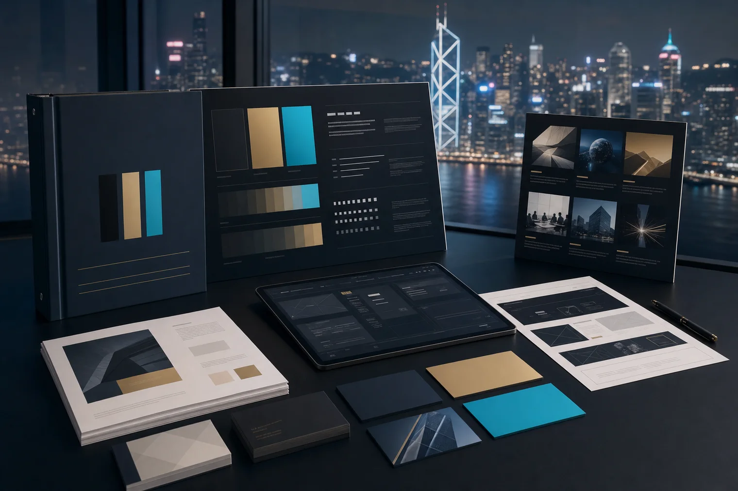
Website & platform
A Malaysia solar website, content, advertising monitoring and business-data collection form a phased BrandOps system.
Website, advertising, social content, suppliers and business data were dispersed. The team needed a structure connecting market education, enquiry handling and ongoing content operations.
The public site, content, advertising monitoring, business data and team notifications are organised as modules that can be enabled in phases with defined responsibilities.
Website and operational workflow development for clean-energy brand HOMI / HomifyTech
The brand website and core content form the foundation. Advertising monitoring, team notifications and business-data workflows are planned and used in phases according to operational need, without guarantees of advertising returns or sales.
Discuss a similar brief →
Website & platform
Print products, specifications, artwork and production enquiries are organised into a clear online ordering experience.
Products have many specifications, while price depends on quantity, material, artwork, timing and delivery. A product list without steps would still produce repeated customer questions.
Product categories, specification choices and a three-step journey reduce complexity, with immediate upload, later submission and design-assistance needs in one enquiry path.
Product content and order-enquiry experience for Starbay Media's own Bay Print printing platform
The site supports browsing and order enquiries. The team confirms pricing, payment arrangements, artwork suitability and delivery; it is not a fully automated payment and production fulfilment service.
Discuss a similar brief →